The basics of prototyping and exporting your plots in R
It’s super rewarding when you finally figure out how to plot and visualize your data. But to show off your plot to the rest of the world, you need to first be able to save and export it from your R Studio workspace.
In this tutorial, I’m going to show you how to prototype, save, and export your plots from R. (Note, I use the term ‘plot’ and ‘figure’ interchangeably to mean the same thing: a data visualization!)
For starters, if you need a tutorial on how to make plots in R, you can check out this video on how to make your first plot. You can also enroll in our full online course on data visualization, titled “Intro to data visualization in R (for ecologists)”.
You can also watch this blog post as a video if you want to follow along with one of the lessons from my full course: 
Let’s start out by loading up some data:
# Load up our data
data(PlantGrowth)

# Look at our data
head(PlantGrowth)
##   weight group
## 1   4.17  ctrl
## 2   5.58  ctrl
## 3   5.18  ctrl
## 4   6.11  ctrl
## 5   4.50  ctrl
## 6   4.61  ctrl
The PlantGrowth data are pre-built into R, so you can load the dataset with just the data() function as I’ve done above. These data describe the weights of plants that were placed under different experimental treatments. Let’s look at those treatments:
# Look at the treatment levels
levels(PlantGrowth$group)
## [1] "ctrl" "trt1" "trt2"
Hmmm… “ctrl”, “trt1”, and “trt2” are not very good descriptions of the treatment levels. We need to describe them better if we want to put these treatment levels in a useful plot. Let’s rename them and we can say that the different treatments reflect different light levels.
# Change the names of the treatment levels
levels(PlantGrowth$group) <- c("Control", "High-Light", "Low-Light")
Now the data look a little better.
# View the levels again
levels(PlantGrowth$group)
## [1] "Control" "High-Light" "Low-Light"
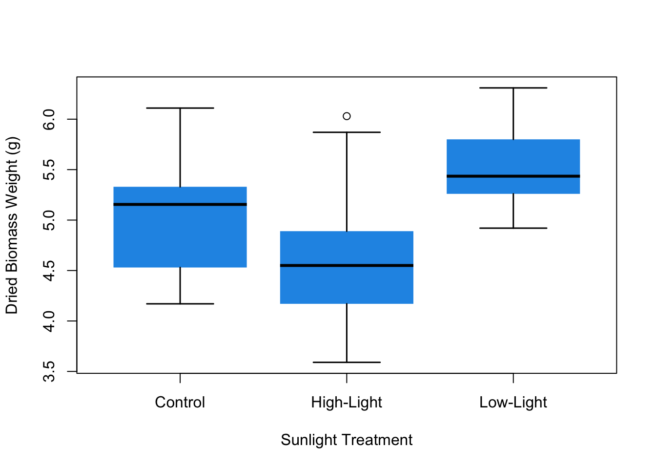
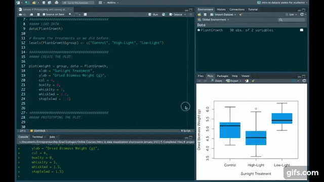
Let’s run this code to create a boxplot (see how I came up with this code in this video).
# Create the plot
plot(weight ~ group, data = PlantGrowth,
     xlab = "Sunlight Treatment",
     ylab = "Dried Biomass Weight (g)",
     col = 4,
     boxlty = 0,
     whisklty = 1,
     whisklwd = 1.5,
     staplelwd = 1.5)
When we just create a plot like this in R Studio, the visual proportions of the plot aren’t set automatically. In other words, your figure is plotted in, and conforms to, the Viewer tab in R Studio. If you drag the size of that viewer, you can make the plot have whatever proportions you want. As a result, it can be hard to come up with figures that have consistent and correct sizing and proportions, especially if you’re making several figures that need to have consistent sizing.
So the general workflow that I use for creating figures is to first create something that looks more or less good in the viewer window. Then I begin prototyping the different sizing and aspect ratio of the figure by writing out the width and height right in the code until I find something that I like.
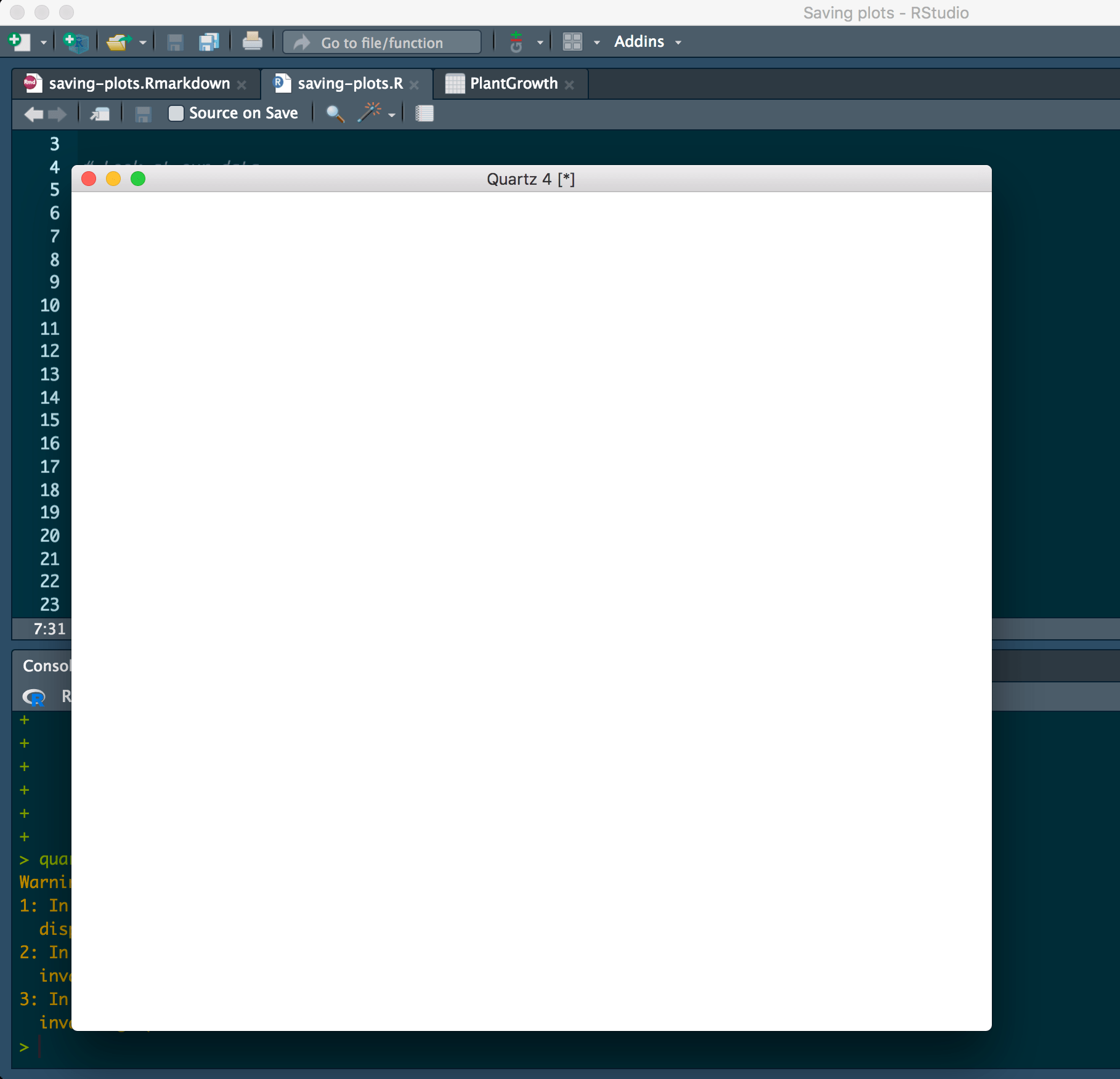
You can do this using the quartz() function on a Mac. If you run quartz(), it will open up a blank graphics device window like this one:
# Open graphics device window
quartz()
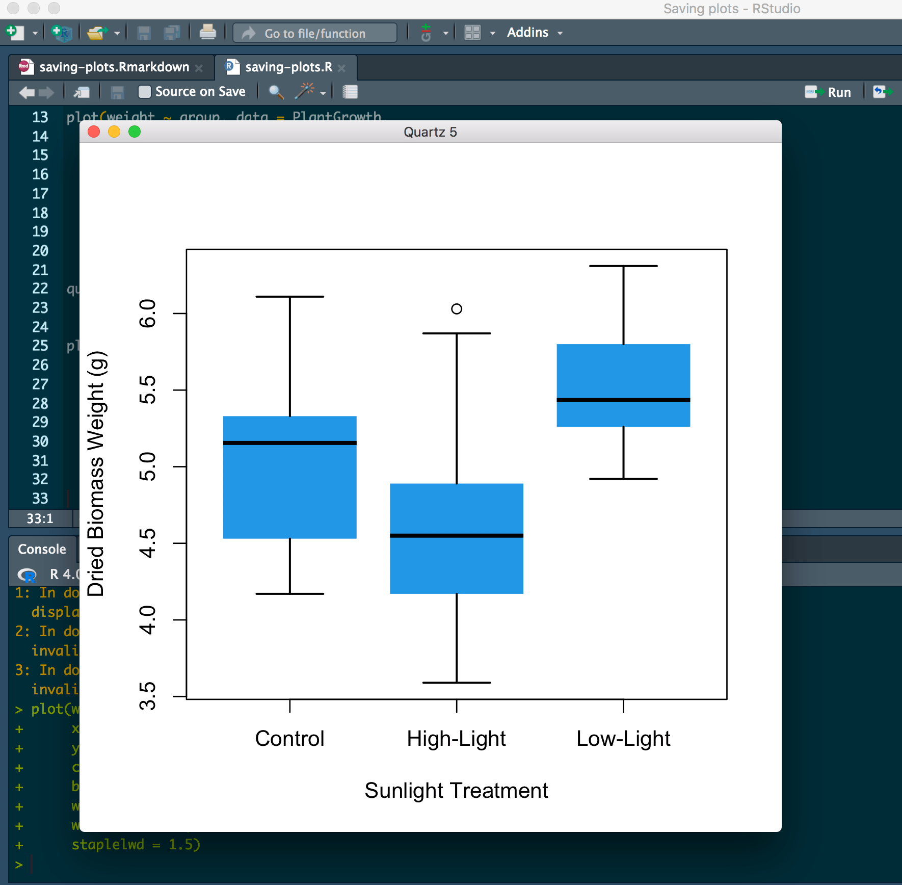
And then if we run our plot code after running quartz(), the plot will show up in the pre-sized window:
(Note that for Windows, you can use the windows() function, and for Linux, you can use the x11() function. I’m going to show how to do it on Mac since that’s the computer I have, but it should be similar on Windows or Linux computers as long as you change the function.)
We can set a standard height and width for the new window, where h is height and w is width:
# Set a standard plot size
quartz(h = 4, w = 4)
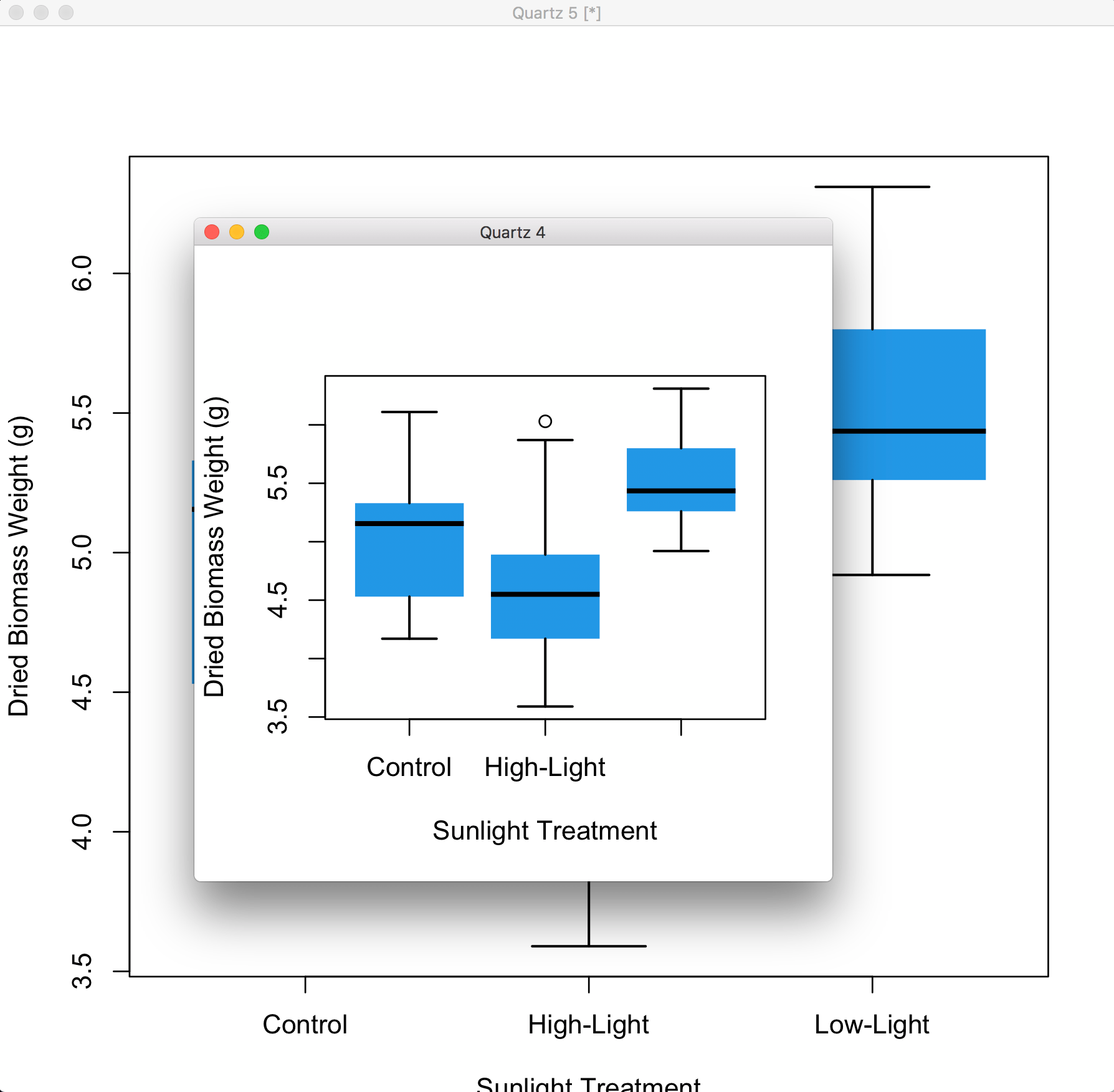
If you don’t specify a height or width, the default size for quartz() is height = 7 and width = 7, measured in inches; as you can see in the image above, our h = 4 and w = 4 Quartz window is much smaller than the default behind it.
But notice that the font sizes and other graphical elements such as line widths or point sizes remain the same size! This is why it’s important to prototype the sizing. For example, it’s quite clear that the smaller 4x4 figure looks a bit better, aesthetically speaking, than the 7x7.
My biggest pet peeve is the common tendency of saving figures with a size that is way too big relative to the font and point size. This creates at best a very unappealing visual, and at worst a figure that is very hard to read or interpret in the first place.
Ok. I’ll stop that rant… :😆:
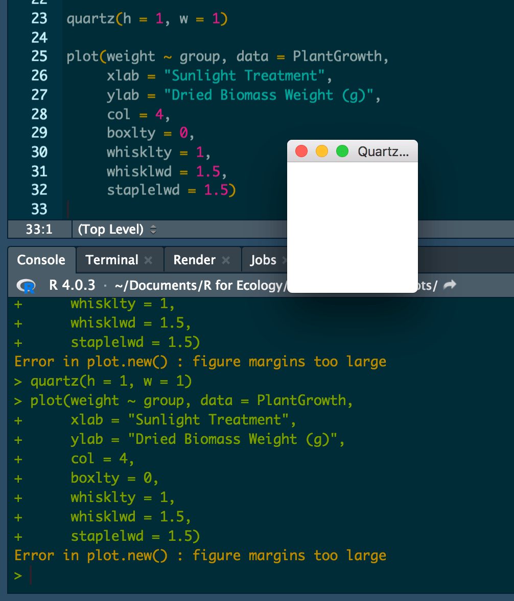
When you’re assigning values to height and width, you should generally use values ranging from 1 to 10. But also watch out if you make the figure too small, because you might receive an error about the figure margins being too large to fit the figure itself.
For example, if I set the window to be 1 inch by 1 inch and then try to run the plot code, the console says Error in plot.new() : figure margins too large
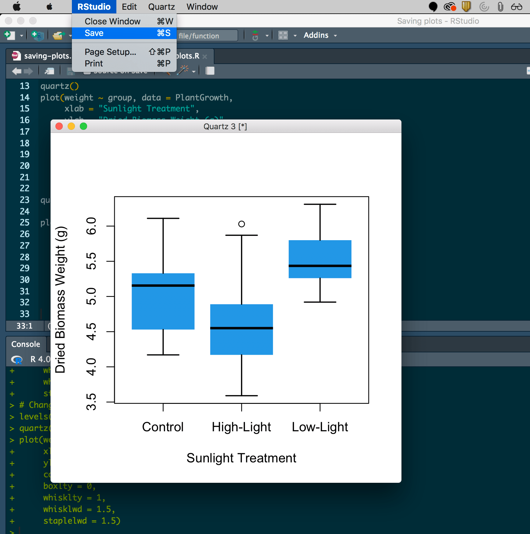
You can keep playing around with the window size until you find something that works for you. Since 1"x 1" was too small, let’s set our plot size at height = 4.5, width = 4.5.
# Set plot size
quartz(h = 4.5, w = 4.5)
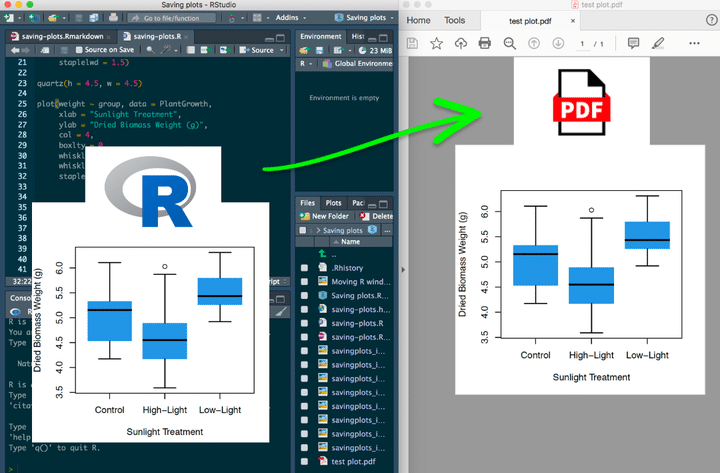
Now we have a plot that we’re happy with! To save the figure from the Quartz window, go to the “RStudio” menu tab and click “Save”. On a Windows computer, you might go to “File” or a similar menu tab.
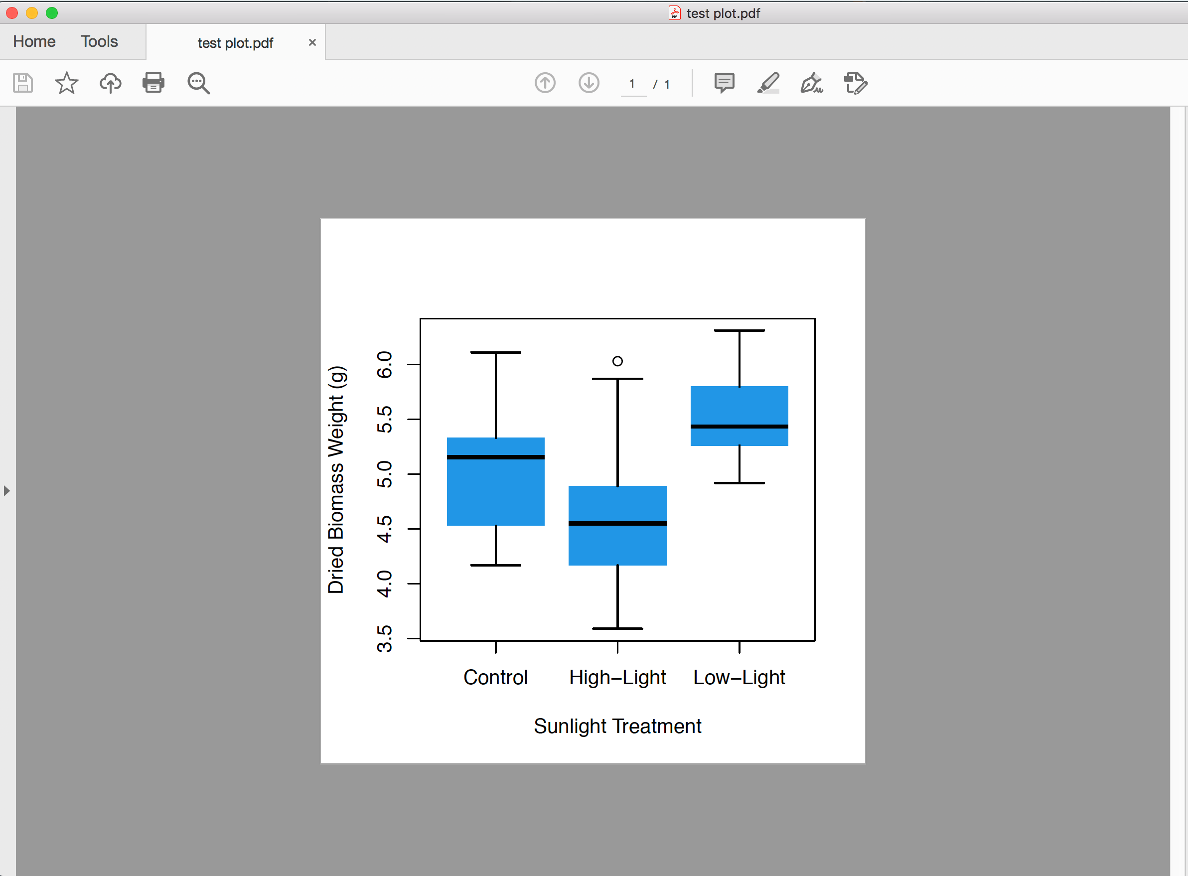
This will prompt you to save your figure as a .pdf file. PDFs are actually one of the best file formats for figures because they have a virtually infinite resolution (try to keep zooming in on a figure you save as a PDF and you’ll see what I mean!). This also means that the file size ends up being pretty large, so you can just convert it to a .jpg or .png whenever you need a smaller file type.
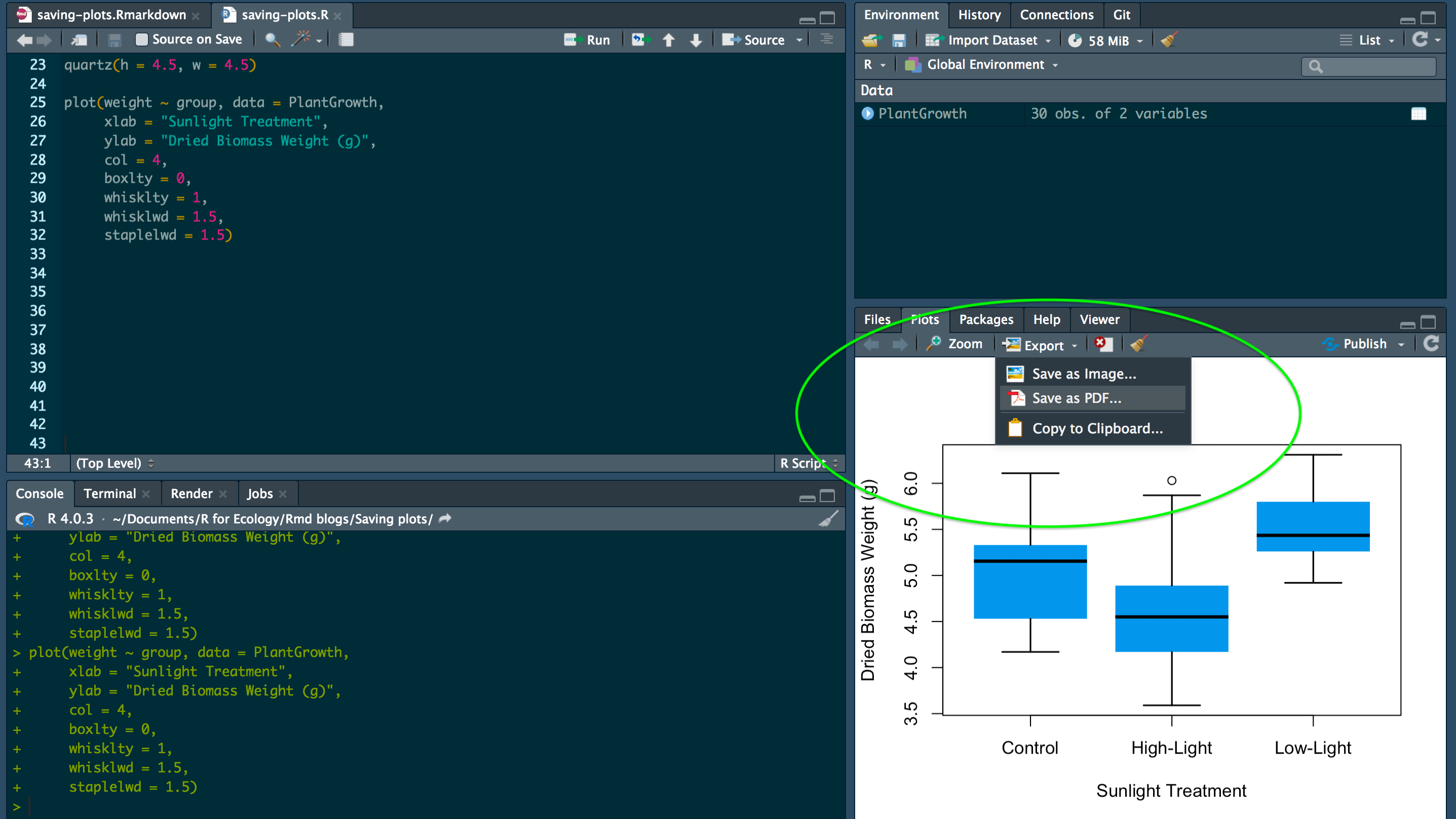
You also have the option to export your figure from the R figure viewer pane, either as an image or as a PDF. When you select either option, a window will pop up that will allow you to choose your figure height and width. The disadvantages of doing this versus using the Quartz window is that you aren’t really able to visualize what your sizing might look like, and if you want to share reproducible code with someone, they won’t know what size to save the figure as.
Now if we go to our files and click on the plot that we saved, we can see it in PDF form.
So those are the basics of prototyping and saving your plots in R. These are the tools I’ve always used for the majority of all my visualization work in R. That’s not to say that there aren’t other (even fancier) ways to save plots directly from the R code. Remember that from the Quartz window you still have to go to File > Save in order to export the plot. However, I find that this simple system using Quartz windows is the perfect intermediary between hard coding everything and total point-and-click exporting. It also lets you easily prototype your figures as you create them.
And that’s it! Remember that if you want to learn more about visualization, be sure to check out my complete course “Intro to data visualization in R (for ecologists)”.
If you liked this and want learn even more more, you can check out the full course on the complete basics of R for ecology right here.
Also be sure to check out R-bloggers for other great tutorials on learning R