How to make a scatterplot in R
How to create and customize your scatterplots
Now that you’ve learned the very basics of plotting from our earlier tutorial on making your very first plot in R, this blog post will teach you how to customize your scatterplots to make them look better. If you want to take this even a step further, check out my step-by-step tutorial introduction to publication-quality scatterplots.
You can also watch this blog post as a video by clicking on the image below. 
Scatterplots are one of the most common types of plots in ecology, where they show the relationship (or lack thereof) between two continuous variables.
We’re going to create the same scatterplot that we did in the other lesson by loading up the data set PlantGrowth.
This data set has 30 rows of data and two columns. The first column, “weight”, represents the dry biomass of each plant in grams. The second column, “group”, lists the experimental treatment that each plant was given. We’re going to add another column to this data set called “water”, which will describe the amount of water that each plant has received throughout its life, in liters. If you’re following along in RStudio (which you should be! 😄), then you can just copy and paste the code below to add the new column.
# Load data
data(PlantGrowth)

# Add a new column
PlantGrowth$water <- c(3.063, 3.558, 2.233, 3.147, 2.379, 2.106, 2.384, 2.444, 2.492, 3.292, 2.732, 2.153, 2.660, 1.938, 3.583, 1.817, 3.494, 2.559, 1.530, 2.372, 3.176, 2.611, 3.262, 2.947, 2.523, 2.152, 2.771, 2.878, 2.263, 2.518)

# View first few rows of data
head(PlantGrowth)
##   weight group water
## 1   4.17  ctrl 3.063
## 2   5.58  ctrl 3.558
## 3   5.18  ctrl 2.233
## 4   6.11  ctrl 3.147
## 5   4.50  ctrl 2.379
## 6   4.61  ctrl 2.106
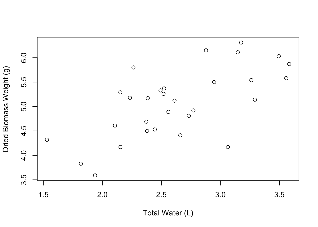
Awesome. Now, using the plot() function, let’s create a plot of plant weight versus the amount of water that the plant received.
# Plot plant weight versus water received
plot(weight ~ water, data = PlantGrowth)
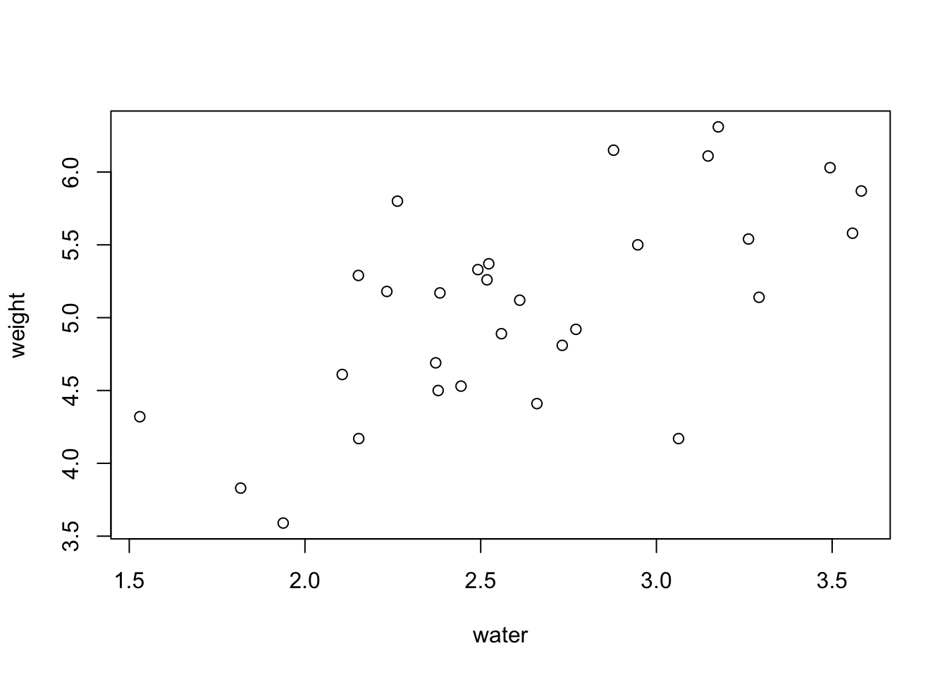
Now we have a basic scatterplot, but it doesn’t look all that great aesthetically. To help with that, I’m going to show you some different customizations that allow you to modify several of the plot elements.
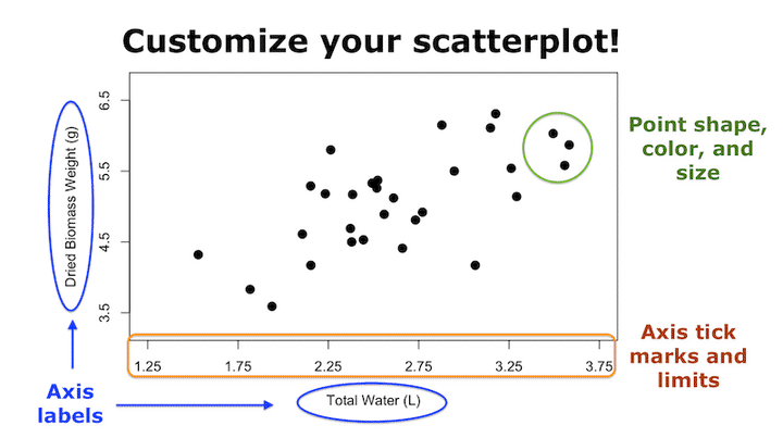
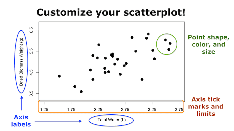
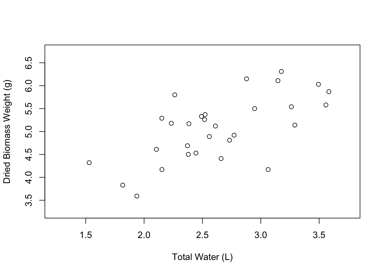
Let’s start with the axis labels. We can modify the xlab and ylab arguments within the plot() function. xlab refers to the label on the X axis, while ylab refers to the label on the Y axis. Notice that I also pressed the “Enter” or “Return” key after each comma in the plot() function. This just keeps the code cleaner and more readable, but you could have also written it all in one long line.
# Edit the axis labels of the plot
plot(weight ~ water,
     data = PlantGrowth,
     xlab = "Total Water (L)",
     ylab = "Dried Biomass Weight (g)")
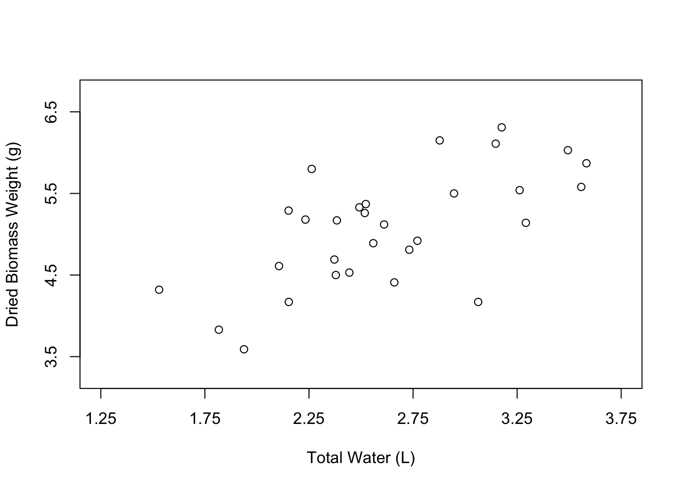
Great! Our axis labels look good. We can also make the graph a little more spacious by editing the limits of the axes. We can do this using the xlim and ylim arguments. These arguments accept vectors of the form c(lower_limit, upper_limit). So if we wanted the X axis to go from 1 to 5, we would say xlim = c(1, 5).
# Edit the axis limits of the plot
plot(weight ~ water,
     data = PlantGrowth,
     xlab = "Total Water (L)",
     ylab = "Dried Biomass Weight (g)",
     xlim = c(1.25, 3.75),
     ylim = c(3.25, 6.75))
Nice, our plot looks a little less crowded. The last aspect of the axes that you might want to change are the axis tick marks. We can do this using the xaxp and yaxp arguments. These arguments accept vectors in the form c(lower_limit, upper_limit, number_of_intervals). So if we want the X axis tick marks to go from 1.25 to 3.75 with 5 intervals in between, we would write xaxp = c(1.25, 3.75, 5).
# Edit the axis tick marks of the plot
plot(weight ~ water,
     data = PlantGrowth,
     xlab = "Total Water (L)",
     ylab = "Dried Biomass Weight (g)",
     xlim = c(1.25, 3.75),
     ylim = c(3.25, 6.75),
     xaxp = c(1.25, 3.75, 5),
     yaxp = c(3.5, 6.5, 3))
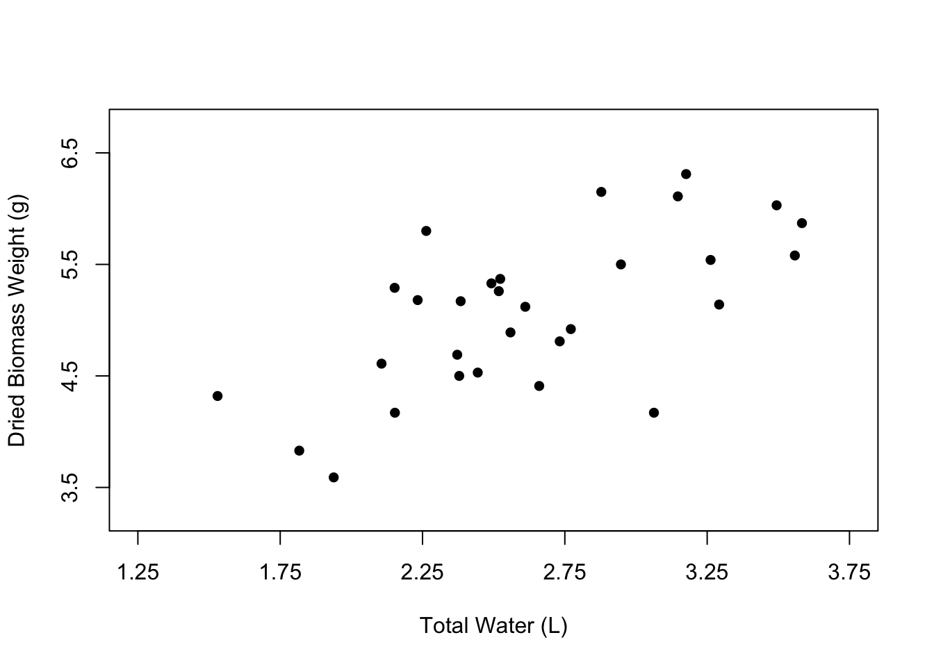
Now let’s change the appearance of the points in the plot. The open circles that we currently have can be nice, especially if many of the points overlap. However, normally we would probably want to have simple, filled-in circles.
We can change the shape of the points using the pch argument. 16 happens to be the value that corresponds to filled-in points, but you can play around with other numbers to see the types of symbols that are available.
# Edit the point shape
plot(weight ~ water,
     data = PlantGrowth,
     xlab = "Total Water (L)",
     ylab = "Dried Biomass Weight (g)",
     xlim = c(1.25, 3.75),
     ylim = c(3.25, 6.75),
     xaxp = c(1.25, 3.75, 5),
     yaxp = c(3.5, 6.5, 3),
     pch = 16)
You can also change the color of the points using the col argument, where you can just type the name of a color in quotes.
# Edit the point shape
plot(weight ~ water,
     data = PlantGrowth,
     xlab = "Total Water (L)",
     ylab = "Dried Biomass Weight (g)",
     xlim = c(1.25, 3.75),
     ylim = c(3.25, 6.75),
     xaxp = c(1.25, 3.75, 5),
     yaxp = c(3.5, 6.5, 3),
     pch = 16,
     col = "blue")
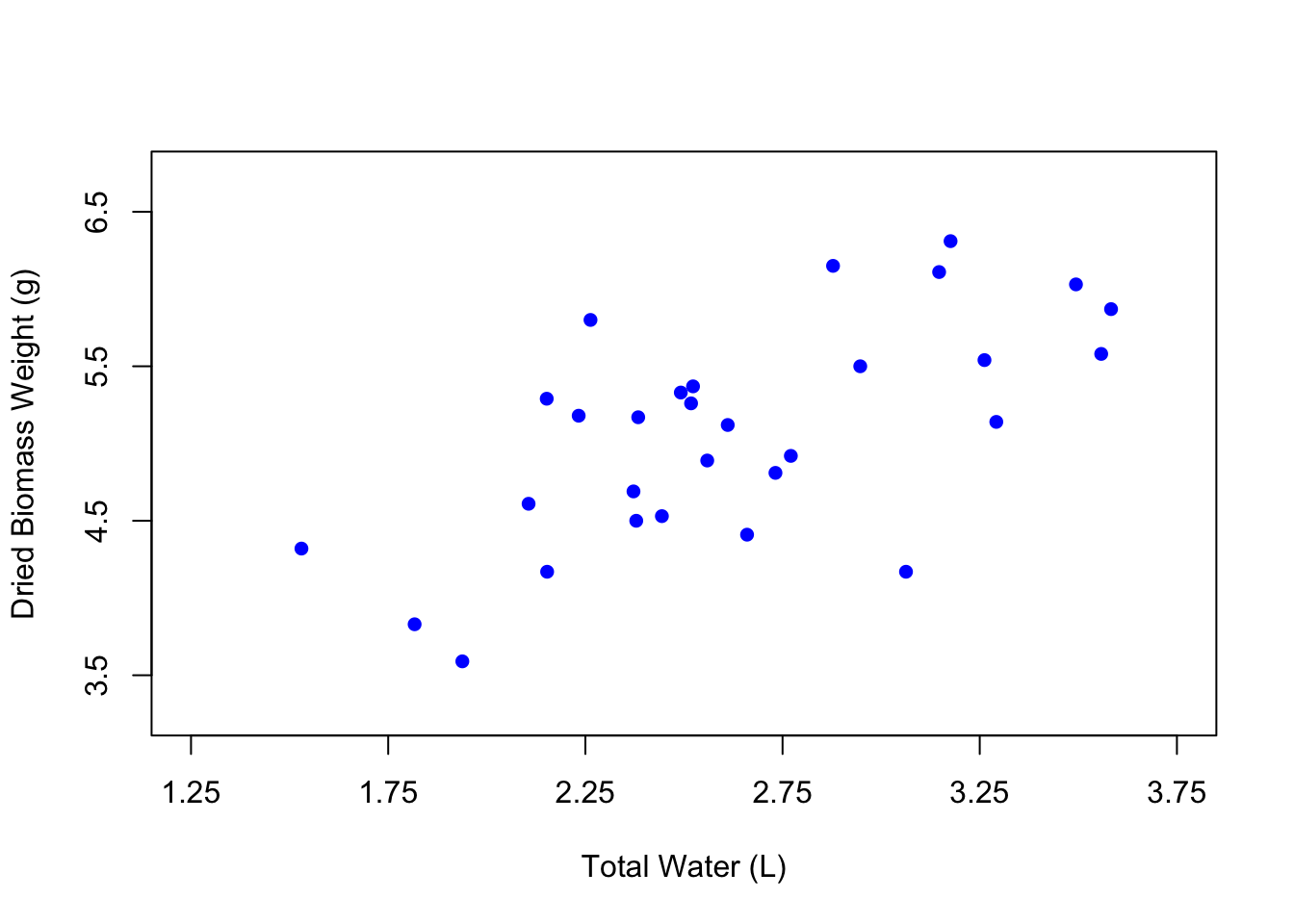
It can be fun to use different colors, but the best practice is to keep your figures in grayscale unless the colors in your figure specifically signify something. In the case of our figure, there isn’t really a reason to change the color of the points except for the purposes of demonstration. So let’s change the color back to black.
You can also change point size using the argument cex. The default for cex is 1, which represents 100%. So if we change the cex argument to 1.5, the points will be 50% larger.
# Edit the point shape
plot(weight ~ water,
     data = PlantGrowth,
     xlab = "Total Water (L)",
     ylab = "Dried Biomass Weight (g)",
     xlim = c(1.25, 3.75),
     ylim = c(3.25, 6.75),
     xaxp = c(1.25, 3.75, 5),
     yaxp = c(3.5, 6.5, 3),
     pch = 16,
     col = "black",
     cex = 1.5)
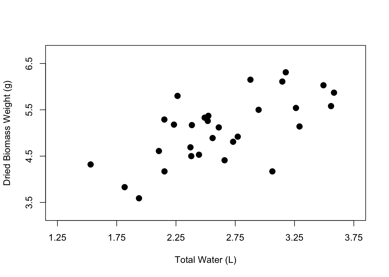
And now we have a nicer-looking scatterplot. The axis labels are clearer, the points have been filled in, and our plot looks less crowded. Now you know how to customize the axis labels, the axis tick marks and limits, and the point shape, color, and size within your scatterplot.
There is of course a lot more that you can do, but this tutorial is aimed at giving you the most important attributes that you can modify in the base plot() function. I used only these for the longest time without needing to branch out to ggplot or other more advanced techniques. But be sure to check out my other tutorial that takes this just a bit further to show you how to make publication-quality scatterplots. Happy visualizing!
Also be sure to check out R-bloggers for other great tutorials on learning R