How to make a boxplot in R
The complete beginner’s tutorial on boxplots in R

In this tutorial, I’m going to show you how to plot and customize boxplots (also known as box and whisker plots). Boxplots are a common type of graph that allow you to look at the relationships between a continuous variable and various categorical groups. They are super common in ecology because we often need to compare values between different categories.

BTW, you can also follow along with a video tutorial of this blog post if you click on the image below:

For this tutorial, we’re going to use the built-in R dataset PlantGrowth, which might seem familiar to you because we used it in a few other data visualization tutorials.
To refresh your memory, PlantGrowth has 30 rows and two columns. The “weight” column represents the dry biomass of each plant in grams, while the “group” column describes the experimental treatment that each plant was given.
# Load the data
data(PlantGrowth)

# View the data
head(PlantGrowth)
##   weight group
## 1   4.17  ctrl
## 2   5.58  ctrl
## 3   5.18  ctrl
## 4   6.11  ctrl
## 5   4.50  ctrl
## 6   4.61  ctrl
Let’s say we want to compare the weight of plants among the different treatments. A boxplot is perfect for this type of visualization.
We’ve already learned about the plot() function in our earlier scatterplot tutorial (see our previous blog post). Something neat about plot() is that if the X axis is a categorical variable, the function will recognize that and will automatically graph a boxplot for you instead of a scatterplot.
If we look at the levels in the “group” column, we can see that “group” is indeed a categorical variable, with three different levels:
# Look at the levels of the "group" column
levels(PlantGrowth$group)
## [1] "ctrl" "trt1" "trt2"
So if we plot weight as a function of group (y as a function of x), we should get a boxplot.
# Make a boxplot of weight as a function of treatment group
plot(weight ~ group, data = PlantGrowth)
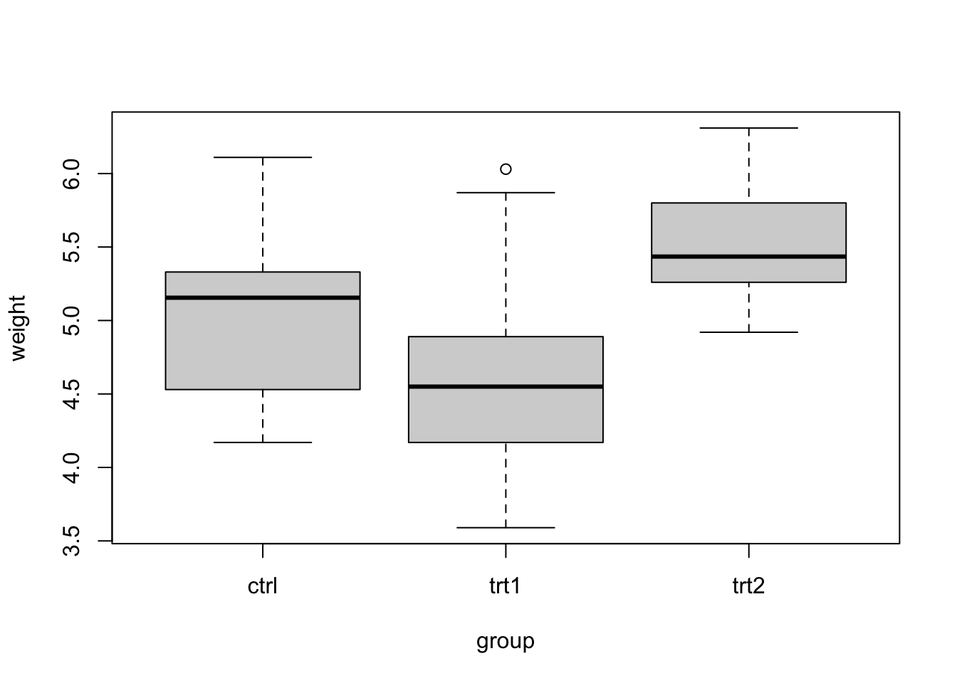
Awesome! We can see plant weight across the three different treatment groups, allowing us to easily compare groups.
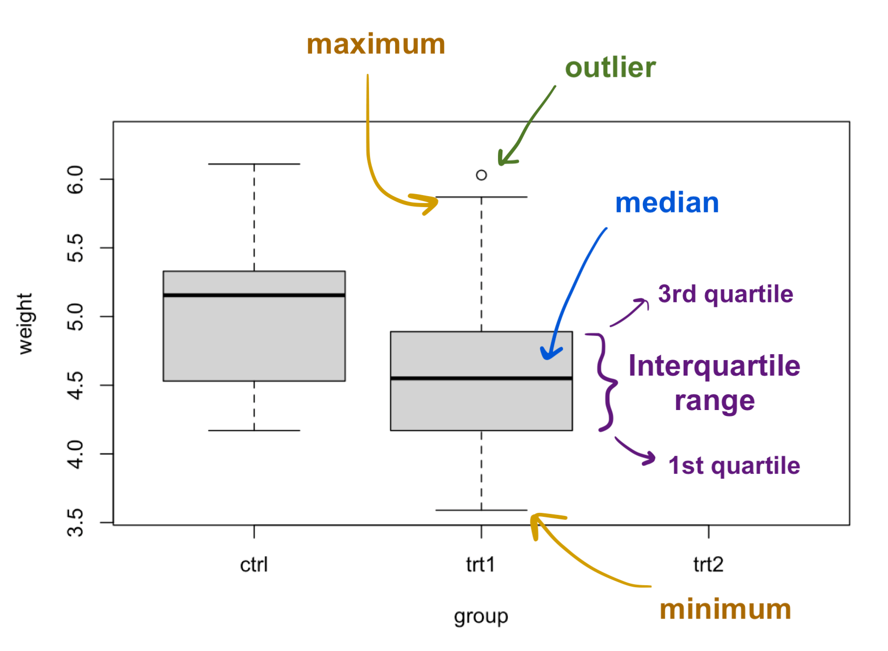
Boxplot components
Now, let’s quickly go over the components of a box plot.
- The solid black line in the middle of each box represents the median of the data.
- The grey box represents the “interquartile range” (IQR) of your data, or the range between the 1st and 3rd quartiles. Values below the 1st quartile represent the lowest 25% of your data points, while values above the 3rd quartile represent the highest 25% of your data. The interquartile range contains the middle 50% of your data points.
- The “whiskers” of a box and whisker plot are the dotted lines outside of the grey box. These end at the minimum and maximum values of your data set, excluding outliers.
- Sometimes, you will have outliers in your data that are shown as points in the plot. Outliers are points that are more than (1.5 * IQR) below the 1st quartile or above the 3rd quartile.
Modifying the axes
Now that we understand all the parts of a boxplot, let’s play around with the different components of the plot, starting with the axes. Customizing the axes is the same as for scatterplots, where we’ll use the arguments xlab and ylab to change the axis labels.
# Adding axis labels
plot(weight ~ group,
     data = PlantGrowth,
     xlab = "Treatment Group",
     ylab = "Dried Biomass Weight (g)")
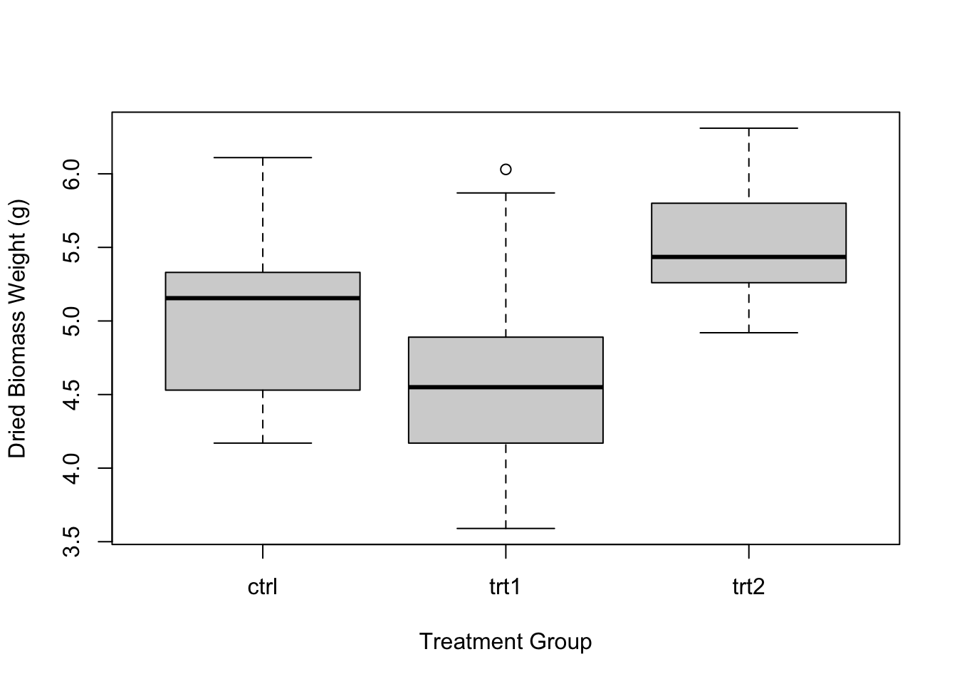
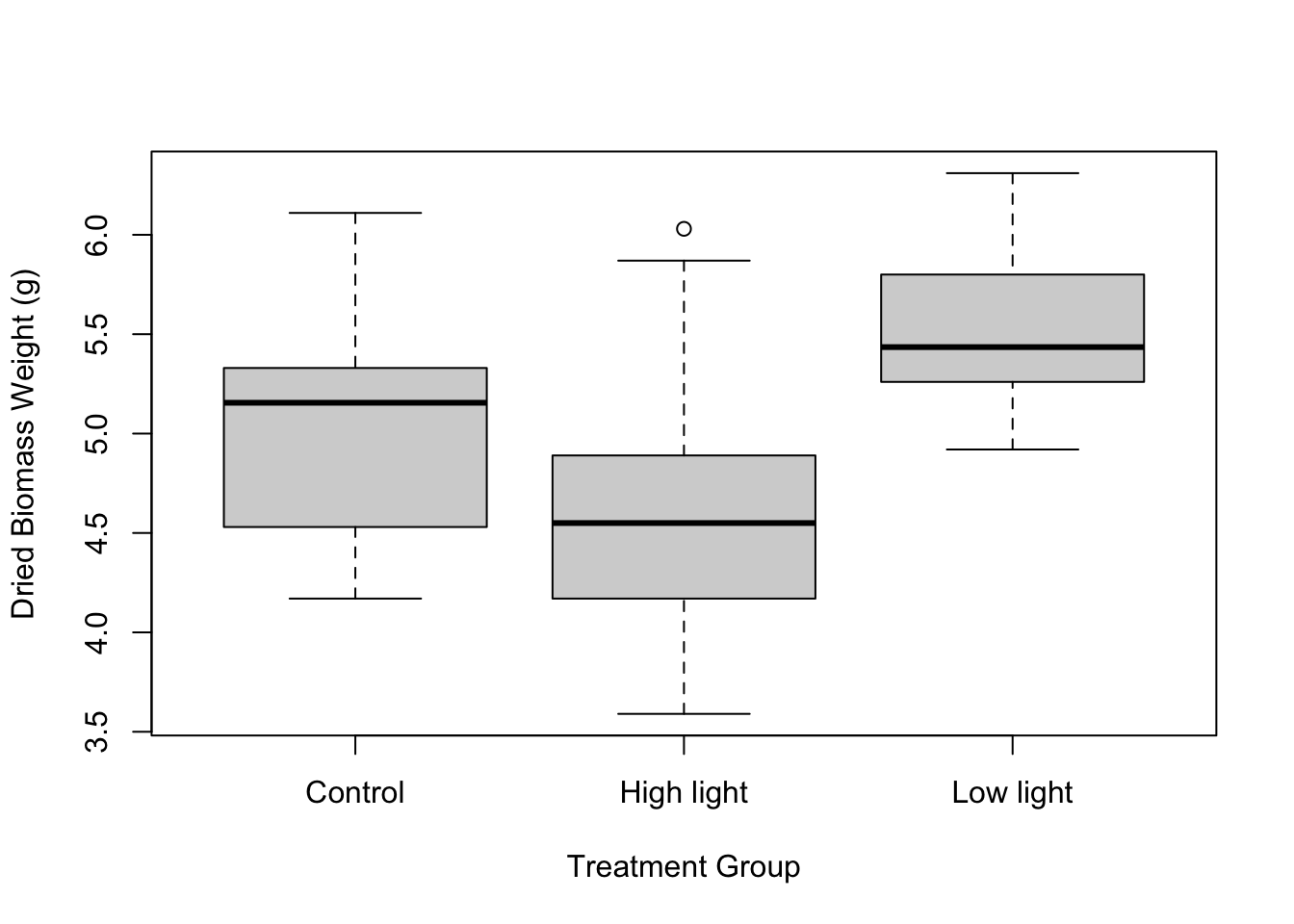
Great, now we have axis labels! But the individual treatment group labels on our X axis are still worded pretty vaguely. To change this, let’s actually go back to our data. Let’s change “ctrl” to “Control”, “trt1” to “High light”, and “trt2” to “Low light”.
# Look at the levels of the group column
levels(PlantGrowth$group)
## [1] "ctrl" "trt1" "trt2"
# Change the names of the treatments in the data set itself
levels(PlantGrowth$group) <- c("Control", "High light", "Low light")

# View the group column again
PlantGrowth$group
##  [1] Control    Control    Control    Control    Control    Control
##  [7] Control    Control    Control    Control    High light High light
## [13] High light High light High light High light High light High light
## [19] High light High light Low light  Low light  Low light  Low light
## [25] Low light  Low light  Low light  Low light  Low light  Low light
## Levels: Control High light Low light
Now that we’ve changed the names of our treatments, let’s run the plot again.
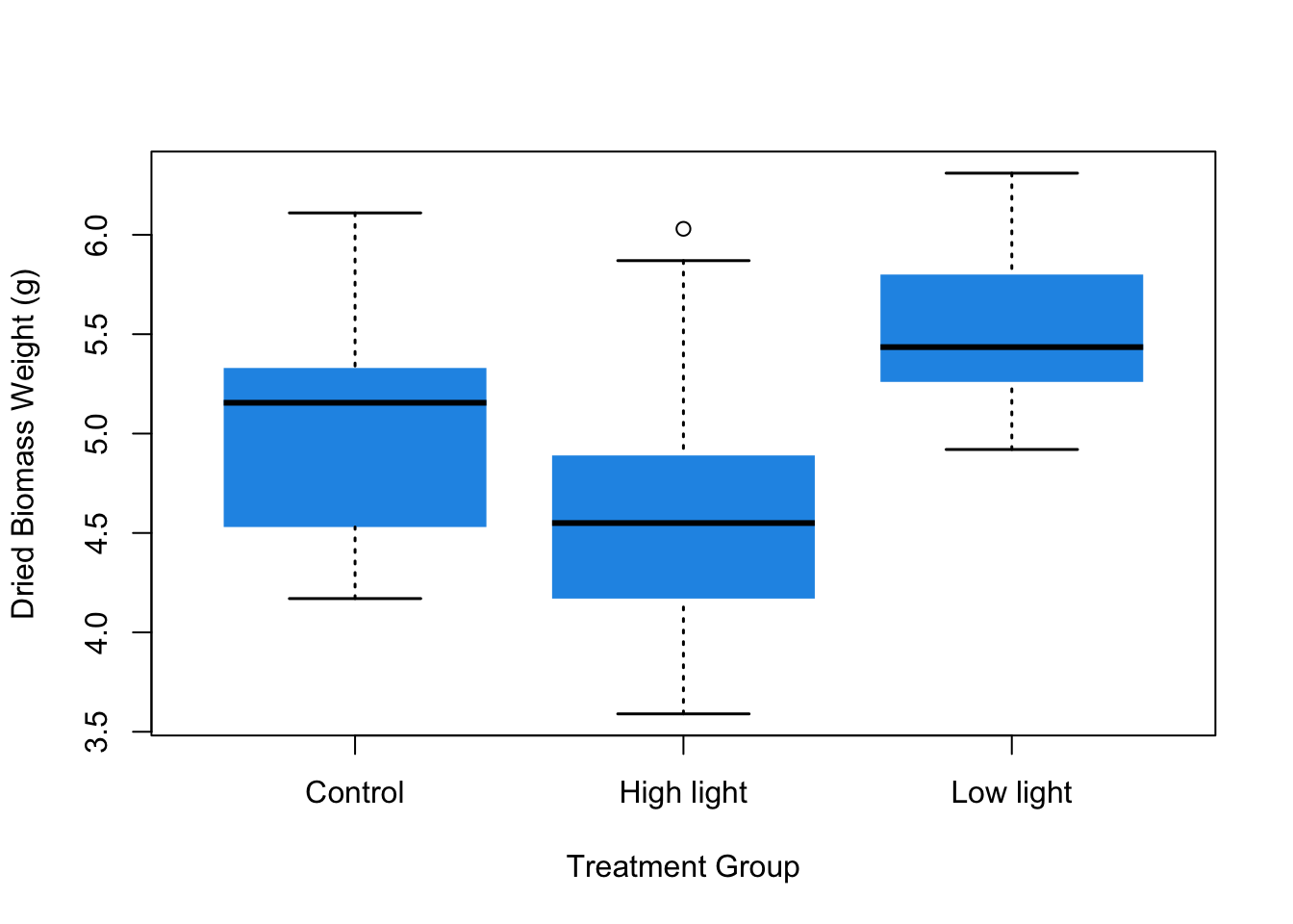
plot(weight ~ group,
     data = PlantGrowth,
     xlab = "Treatment Group",
     ylab = "Dried Biomass Weight (g)")
Modifying the boxes and whiskers
Our plot is looking pretty good so far. Now let’s see how we can change the appearance of the boxes and whiskers. We can do this using the col argument, which accepts any color name or hex code in quotes. You can also set col to any number, which represents a predetermined color.
plot(weight ~ group,
     data = PlantGrowth,
     xlab = "Treatment Group",
     ylab = "Dried Biomass Weight (g)",
     col = 4) # or something like "blue" or a hex code like "#f234f9"

It can be fun to use colors, but it’s data visualization best-practice to keep your figures black and white (or grey-scale) unless you need to use colors to signify something in particular. Note that in the case of our figure, there isn’t really a reason to change the color of the boxes except for the purposes of demonstration here.
We can also change the appearance of the boxes' borders using boxlty, which stands for “box line type”. This argument can accept integers, which represent different line types. 1 corresponds to a normal line, 2 corresponds to a dashed line, and 0 corresponds to no line. You can test out other numbers, too! For now, let’s get rid of the box borders.
plot(weight ~ group,
     data = PlantGrowth,
     xlab = "Treatment Group",
     ylab = "Dried Biomass Weight (g)",
     col = 4,
     boxlty = 0)

To change the whisker line type, you can use the argument whisklty, which works the same way as boxlty. You can also change whisker line thickness using whisklwd.
plot(weight ~ group,
     data = PlantGrowth,
     xlab = "Treatment Group",
     ylab = "Dried Biomass Weight (g)",
     col = 4,
     boxlty = 0,
     whisklty = 3,
     whisklwd = 1.5)

Lastly, you can change the line thickness of the ends of the whiskers (these are called staples) using the staplelwd argument.
plot(weight ~ group,
     data = PlantGrowth,
     xlab = "Treatment Group",
     ylab = "Dried Biomass Weight (g)",
     col = 4,
     boxlty = 0,
     whisklty = 3,
     whisklwd = 1.5,
     staplelwd = 1.5)
You’ll notice that the arguments boxlty and whisklty seem similar, and that whisklwd and staplelwd also seem similar. You might have already figured out that to change the different plot components and their attributes, you can just mix and match box, whisk, and staple with lty, lwd, and col (which changes the color).
Changing the boxplot orientation
The last thing you can modify is the orientation of the boxplot. Right now, the boxes and whiskers are oriented vertically. If you want them to be horizontal, you can just add the argument horizontal = TRUE. This can be especially helpful if you have a lot of groups that you want to compare.
plot(weight ~ group,
     data = PlantGrowth,
     xlab = "Treatment Group",
     ylab = "Dried Biomass Weight (g)",
     col = 4,
     boxlty = 0,
     whisklty = 3,
     whisklwd = 1.5,
     staplelwd = 1.5,
     horizontal = TRUE)
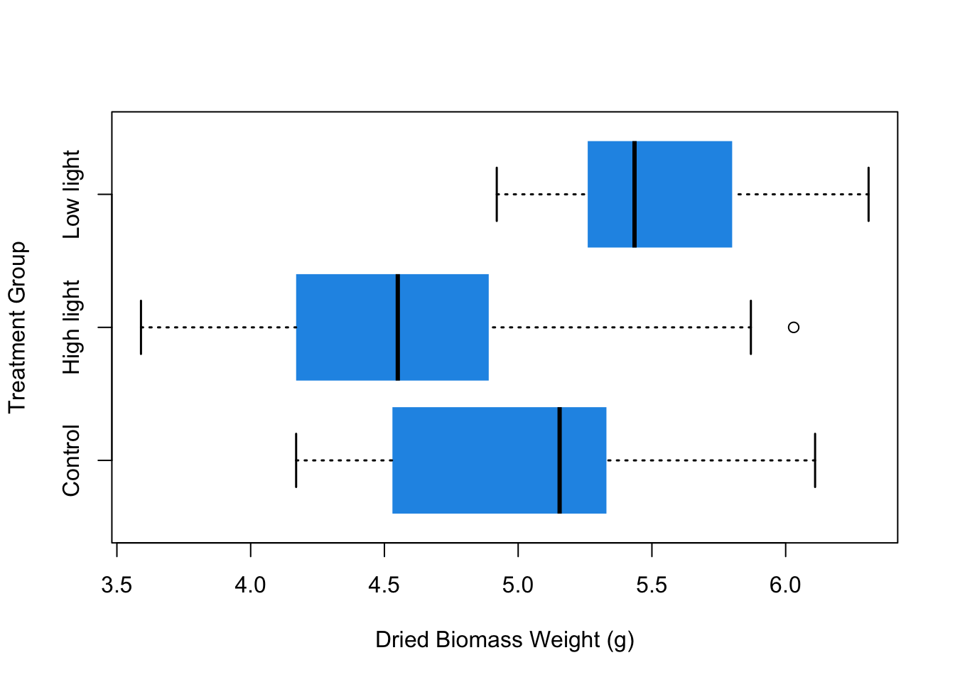
And that’s it! Now we have a good-looking boxplot. In this tutorial I went over what the different parts of a boxplot mean, as well as how to modify the axes, the boxes and whiskers, and the orientation of the plot.
I hope you enjoyed this post! If you liked this and want learn more, you can check out my full course on the complete basics of R for ecology right here or my course on data visualization with R (for ecologists) by clicking the link below.
Also be sure to check out R-bloggers for other great tutorials on learning R