A *simple* introduction to ggplot2 (for plotting your data!)
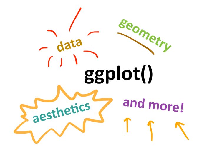
How ggplot2 works, or learning the basics of ggplot2: data and aesthetics and geometry, oh my!
If you’ve ever been totally confused by ggplot2 and what it is or how it works, my intention is that this short tutorial simplifies it down to a conceptual level from which you can build up later. Hope you enjoy!
Data visualization is a powerful tool for scientists and their audiences to easily grasp relationships and trends in data. Some of you may already know how to generate plots using base R. In this blog post, we’re going to introduce a package called “ggplot2” that makes it more intuitive to create consistently nice-looking figures in R.
You can also watch this blog post as a video if you want to follow along while reading:

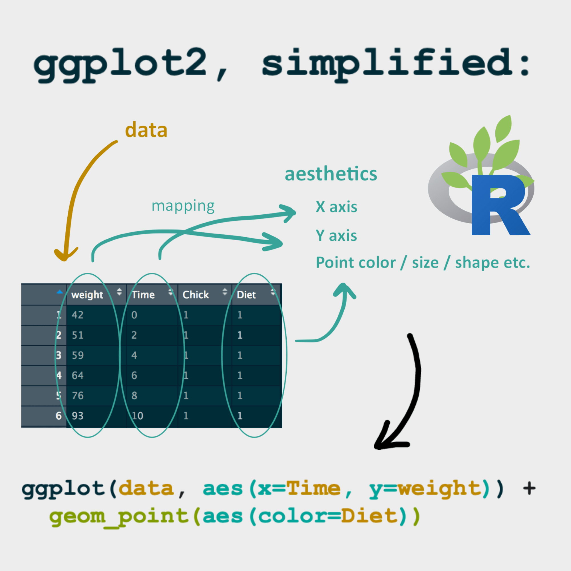
The “gg” part of “ggplot2” stands for the grammar of graphics. Just like sentences are composed of various parts of speech (e.g., nouns, verbs, adjectives) that are arranged using a grammatical structure, ggplot2 allows us to create figures using a standardized syntax.
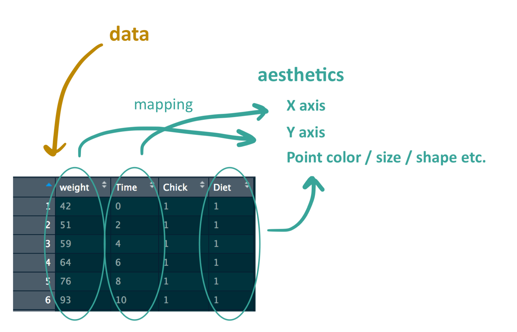
The first element in data visualization is your data, of course! Let’s load up a data set that comes built into R, called ChickWeight, and take a quick look at it. The data describes the weights and ages of chicks that are fed different diets.
# Load data
data(ChickWeight)
head(ChickWeight)
##   weight Time Chick Diet
## 1     42    0     1    1
## 2     51    2     1    1
## 3     59    4     1    1
## 4     64    6     1    1
## 5     76    8     1    1
## 6     93   10     1    1
The next element is the aesthetics. This includes things like which variable goes on the X axis, which variable goes on the Y axis, and what size, shape, or color you want your points/lines/bars/etc. to be. You might have already noticed, but in this blog post, I’m going to assign different colors to the different graphical elements so that you can quickly pick them out in the syntax.
Let’s say we want to create a scatterplot showing weight versus time for these chicks. We’re going to assign time to the X axis, weight to the Y axis, and we want the different diets to show up as different point colors. When we assign variables to the different aesthetic elements, this is called “mapping” the variables to the elements.
Once you figure out how you want to map your data to aesthetic elements, then you present your data using a geometric object, like a scatterplot, boxplot, lineplot, etc.
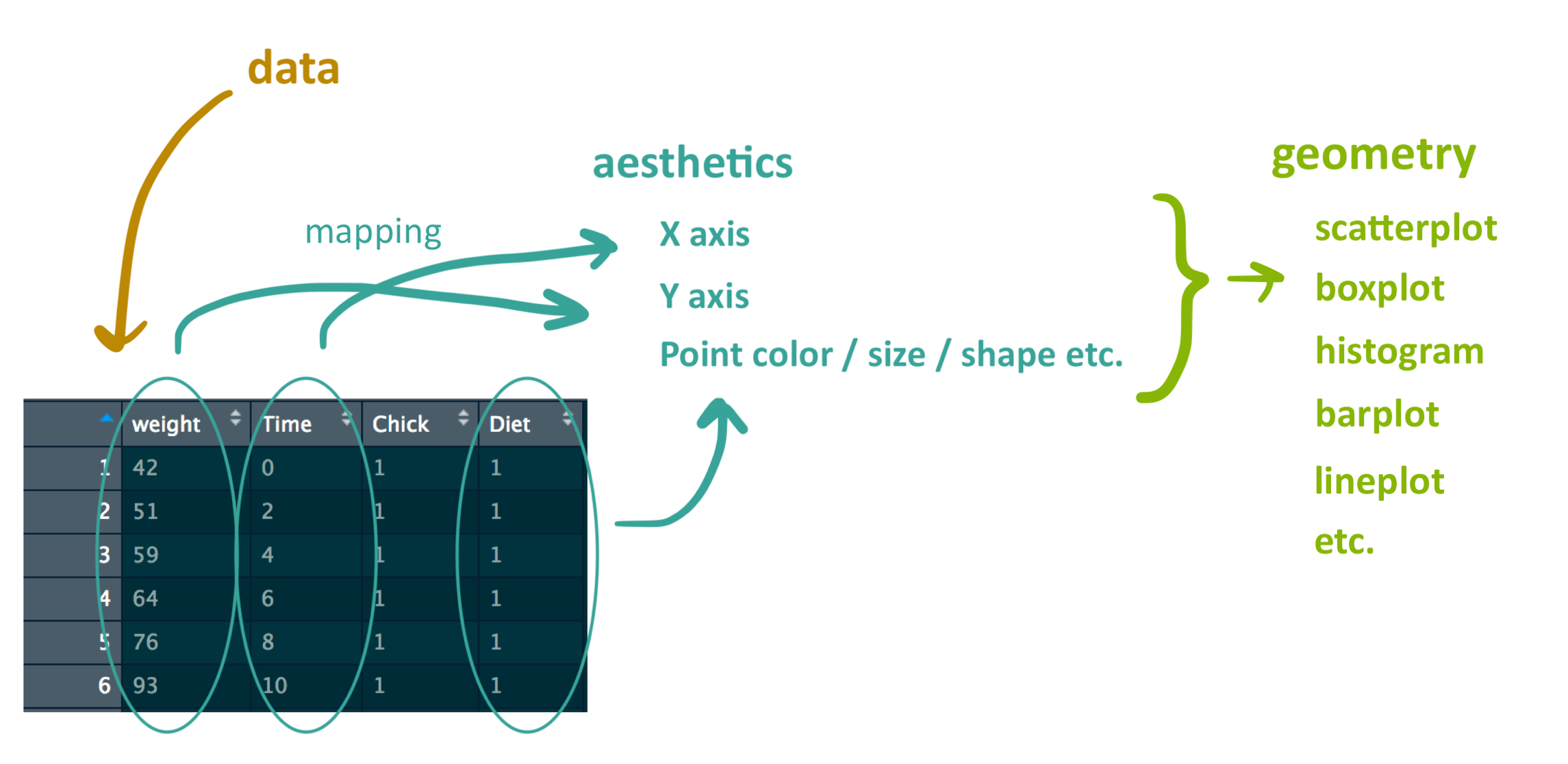
So now we’ve talked about the essential graphical elements: data, aesthetics, and geometry.
There are a couple more elements in ggplot such as the coordinates, which allow you to choose what part of the plot you’re showing, and the theme, which allows you to decide how the graph looks in terms of things like font color, font family, and font size. If you don’t specify them, ggplot will just use the default settings for your plot.
Now let’s see how we actually code this in R! The basic method of constructing a figure in ggplot begins with the function:
ggplot()
Notice that this doesn’t say ggplot2(), though that’s the name of the package.
The first argument in the function are the data:
ggplot(data)
Then, we add the aesthetics:
ggplot(data, aes(x, y))
What would happen if we tried to plot this right now using the data? Remember when we loaded up ChickWeight way back at the start of this blog post?
ggplot(ChickWeight, aes(x = Time, y = weight))
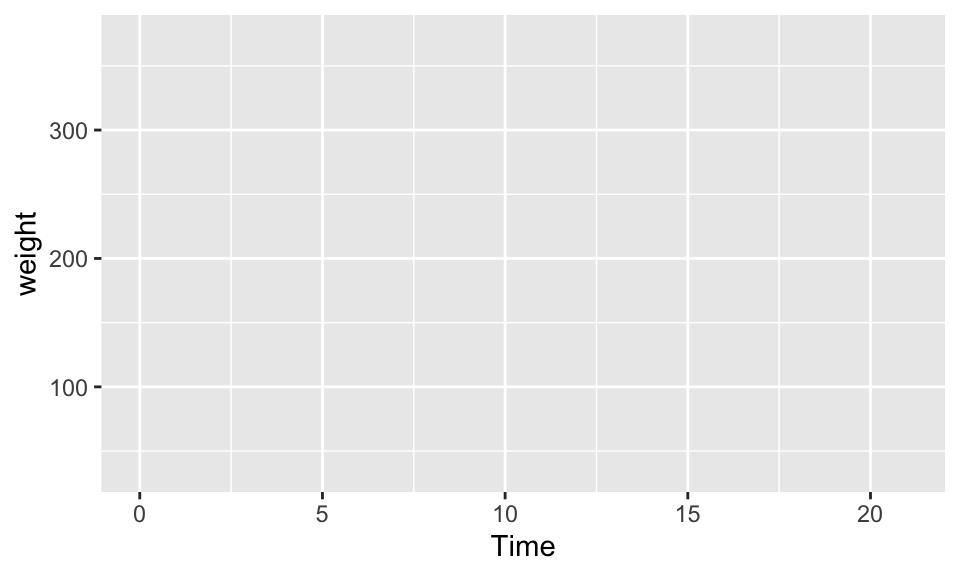
We do see time on the X axis and weight on the Y axis, but nothing has shown up in the actual bounds of our plot because we’re missing our geometry.
To add a geometry object to the ggplot() function, we just have to add a "+" sign, add a new row, and add the geometry.
The function for a scatterplot is geom_point(). This specific function changes depending on what kind of plot you want, but the functions all begin with **geom_**. Within geom_point(), we can also specify aesthetics such as color or fill of the points, or any other aesthetic property that might be connected to the data. So now we have:
ggplot(data, aes(x, y)) +
geom_point(aes(color))
Now to actually put the data in! To map data to aesthetics, we just set the aesthetics equal to whatever the variable name is in our dataframe. Using the current data, the code should look like this:
ggplot(ChickWeight, aes(x = Time, y = weight)) +
  geom_point(aes(color = Diet))
And now if we plot it…
ggplot(ChickWeight, aes(x = Time, y = weight)) +
geom_point(aes(color = Diet))
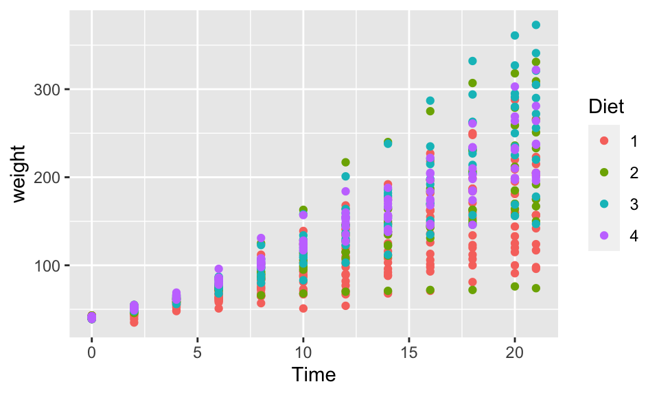
Ta-da! We have a graph showing chick weight versus time, and we are able to represent different chick diets with different colors in the figure. Notice that ggplot automatically adds in a legend for you.
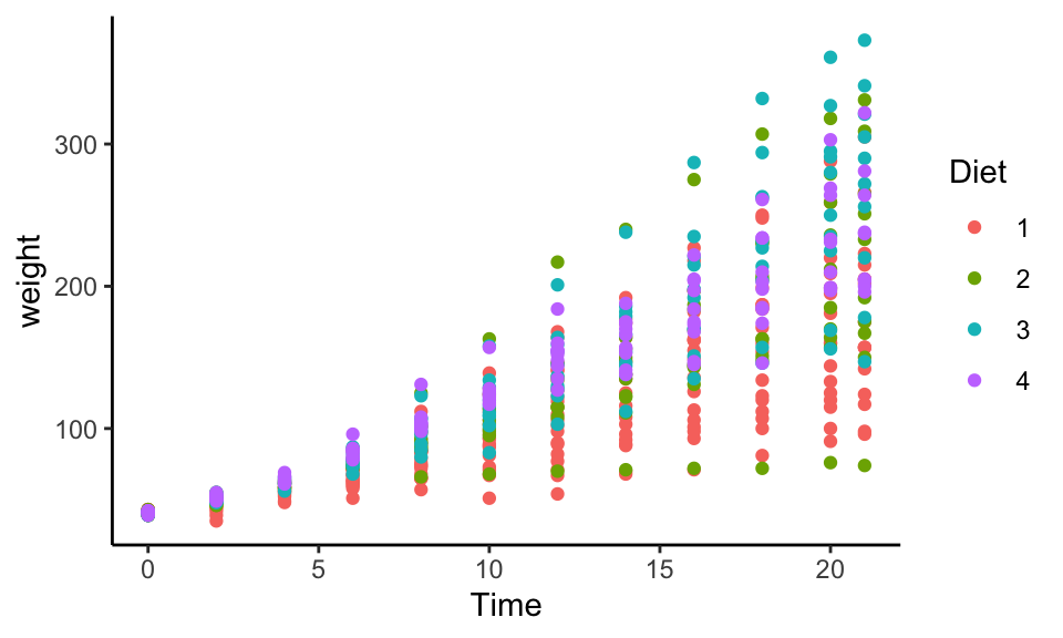
If we really want, we can also add in other elements such as the coordinates and theme like so (the X’s are stand-ins for various functions that could fill in the space, such as “theme_classic()”, for example):
ggplot(ChickWeight, aes(x =Time, y = weight)) +
geom_point(aes(color = Diet)) +
coord_XXX() +
theme_XXX()
If we plot this out, it might look something like this:
ggplot(ChickWeight, aes(x = Time, y = weight)) +
  geom_point(aes(color = Diet)) +
  coord_cartesian() +
  theme_classic()
And don’t worry if all this gets a bit confusing or hard to remember after the basic graphical elements. Luckily there’s a cheatsheet online to help you remember everything that you can do with ggplot2.
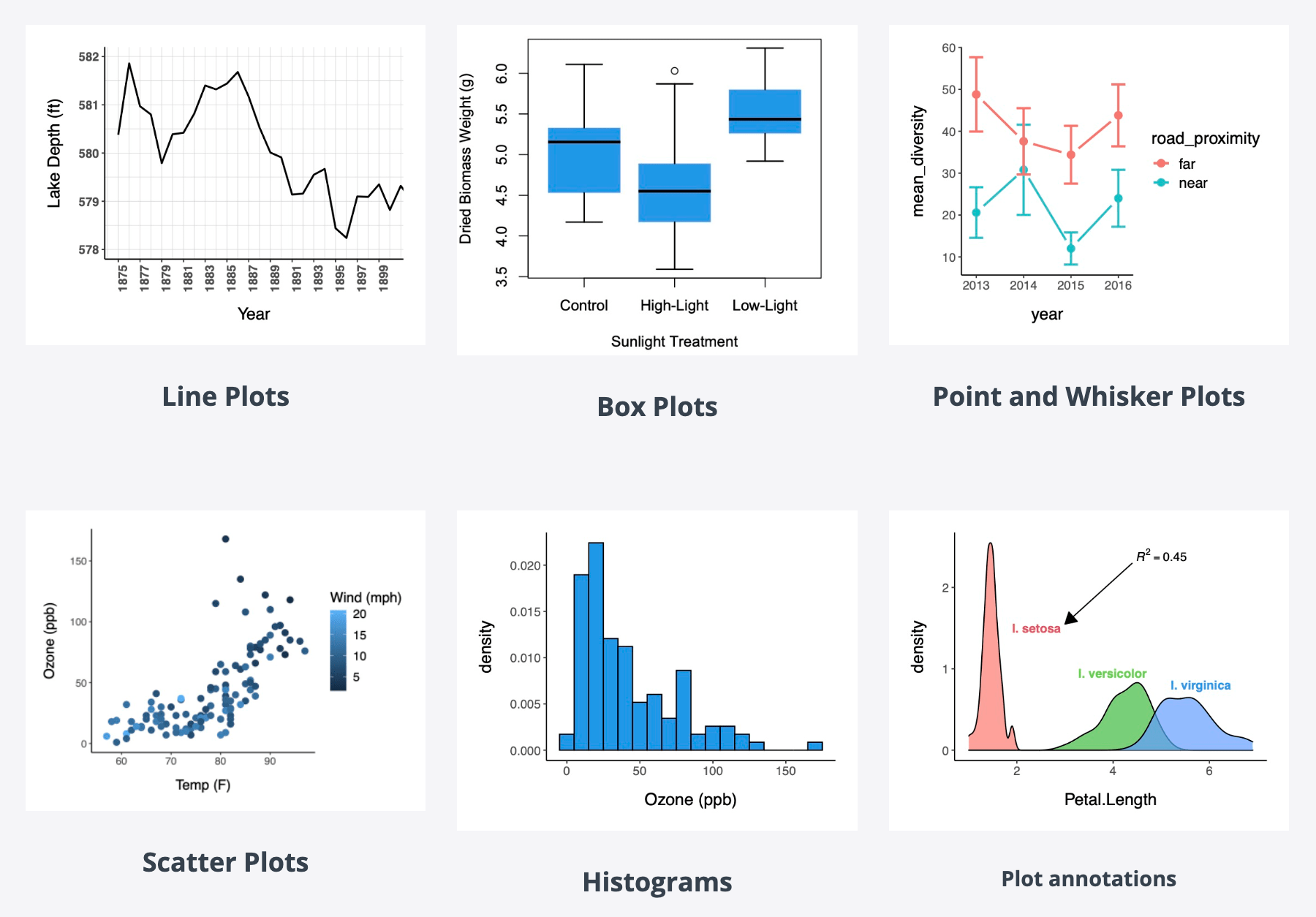
Hope you enjoyed this brief introduction to ggplot2! It took me a long time to come to terms with learning how to ggplot, but when I finally did, it really did change how I do data visualizations. If you want to learn even more about how to create different types of figures with ggplot2, check out my full online course in data visualization, titled “Introduction to data visualization in R (for ecologists)” here. There I go over the five key types of plots in R for ecology and much more! Here’s a sample of what you’ll learn to create in that course:
Also be sure to check out R-bloggers for other great tutorials on learning R